The Jewish Chronicle
Product Design, Design System, Visual Design, UI, Print Publication Design, Advertisement, Social MediaFounded in 1841, The Jewish Chronicle is the oldest continuously published Jewish newspaper in the world, based in London. It reflects the diverse spectrum of Jewish religious, social, and political perspectives across various topics and publications.
DuringThe company rebranding we partnered with 10Up to create a new website and move towards a digital subscription-based model. This meant that all other products and channels ,such as print and social media, needed to be redesigned following the new style guidelines.
As a full-time graphic designer for The JC my role is to create content that adheres to brand guidelines for print, digital,social media, internal channels and specific campaigns. During the brand’s redesign I was put put in charge of product design to develop all the components and templates for the print edition and social media following the new brand guidelines as well as expand those guidelines throught all output channels the company uses.


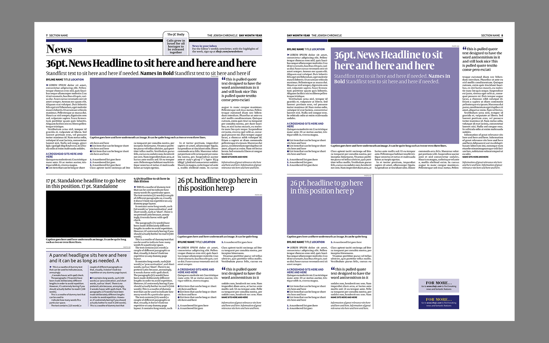
Some of the challenges faced during the development was typography and styles for the print edition. Due to a limitation in the content management system that the company started using in 2015 the styles were locked and it was very difficult to update them. This meant that over the years very little change was possible in any of the components and every time something was redesigned a lot of patches were added creating a situation were most of the nested styles were broken generating a lot of work-flow issues for the team. This also meant that, even thought new typographies were selected for the rebrand they could not be used in the print edition until this CMS was updated.
My main objectives for this redesign was to work around the system’s limitations in order to create a new future-proofed style guide that was accessible and easy to edit so it could be propperly mantained as well as bring the whole look and feel of the publication as close to the digital product as possible and generate a new design system for the social media content.
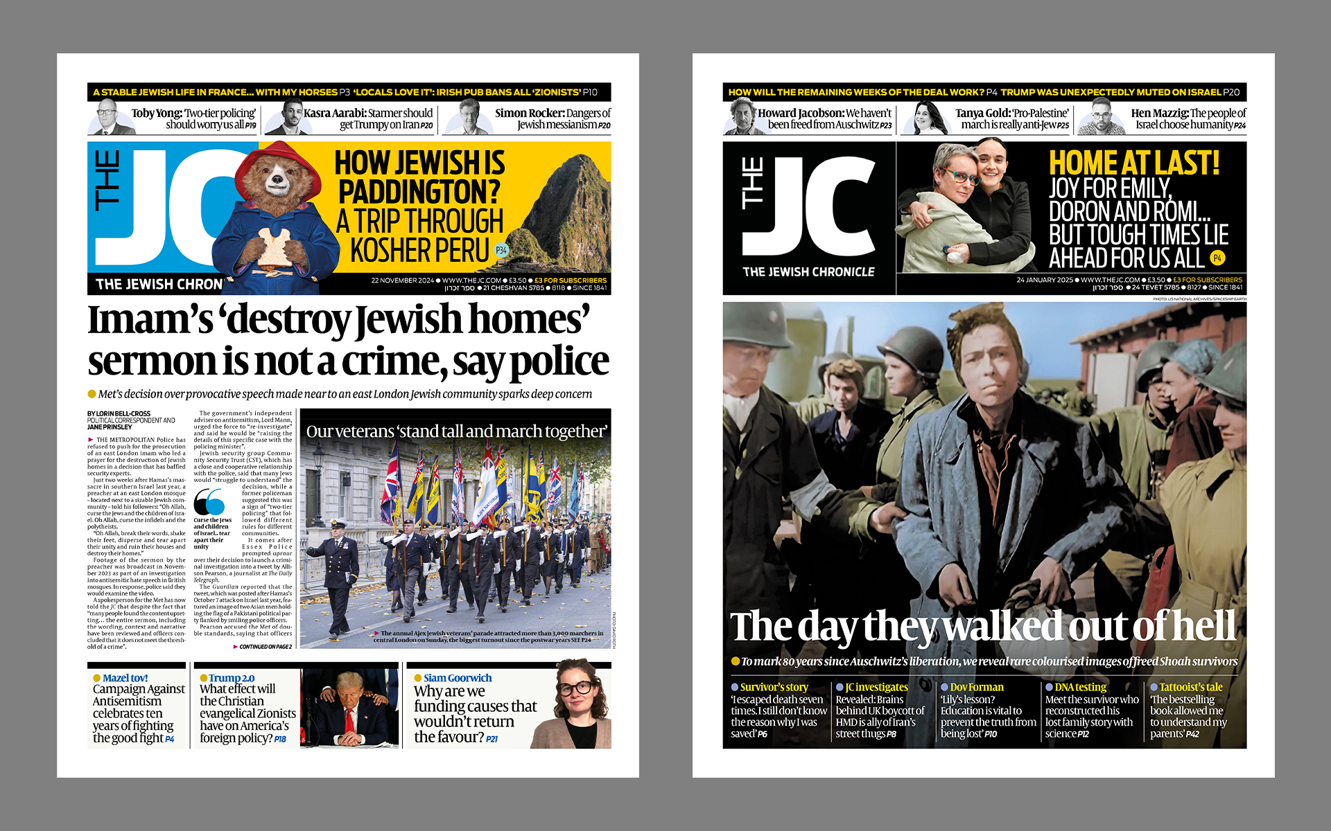
New branding, fonts and colour palette.
The result is a robust and adaptable new design guidelines with an entire new arquitecture of nested styles that not only refresh the products in line wit the new branding and direction for the company, but also will improve workflow and efficiency for the team and will ensure that they can be easily mantained and updated for years to come.


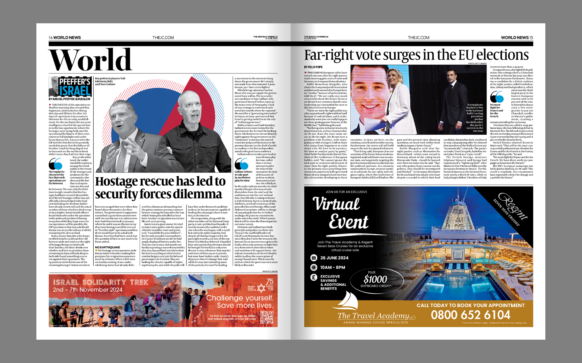
For a publication with so many ads, content density was an issue. One of the priorities with the print redesign was to balance out the amount of content with more negative space and larger text elements like pulled quotes and standfirsts that would break up the dens and rigid structure of the copy. Other changes like the introduction of thin rules in replacement of the old thick ones helped not only integrate better the new Bodoni type but also to give a more lightweight and refined look and feel.


The same principles were applyed throught the entire publication taking inspiration from the new website in order to design the different components.


For the social media content the company focuses on pulling stories from the web into the instagram platform to give them more visibility and engagement as well as some more lighthearted content like top 10 lists, recipes and explainers. The same look and feel from the web design has been brought to this content and a set of modular templates have been developed so more time-sensitive stories can be produced and published with a quick turnaround.
Advertorial, motion and static.